

Ví dụ một tính huống chúng ta cần truyền component qua prop, chúng ta có <Button /> với icon
const Button = ({ children }): { children: ReactNode }) => {
	return (
		<button>
			<SomeIcon size="small" color="red" />
			{children}
		</button>
	)
}
Để cho phép thay đổi icon, chúng ta sẽ cho phép truyền thêm prop icon là một React element
type ButtonProps = {
  children: ReactNode;
  icon: ReactElement<IconProps>;
};

const ButtonWithIconElement = ({ children, icon }): ButtonProps) => {
	const icon = getIconFromName(name)
	return (
		<button>
			{icon}
			{children}
		</button>
	)
}

// sử dụng
<ButtonWithIconElement  icon={<AccessAlarmIconGoogle  />}>button here</ButtonWithIconElement>
hoặc icon là một React Component
type ButtonProps = {
  children: ReactNode;
  Icon: ComponentType<IconProps>;
};

export const ButtonWithIconComponent = ({ children, Icon }: ButtonProps) => {
  return (
    <button>
      <Icon />
      {children}
    </button>
  );
};

// sử dụng
import  AccessAlarmIconGoogle  from  '@mui/icons-material/AccessAlarm';

<ButtonWithIconComponent  Icon={AccessAlarmIconGoogle}>button here</ButtonWithIconComponent>;
hoặc cách thứ 3 là truyền nó vào như một function
type ButtonProps = {
  children: ReactNode;
  renderIcon: () => ReactElement<IconProps>;
};

export const ButtonWithIconRenderFunc = ({ children, renderIcon }: ButtonProps) => {
  const icon = renderIcon();
  return (
    <button>
      {icon}
      {children}
    </button>
  );
};

// sử dụng
<ButtonWithIconRenderFunc  renderIcon={()  =>  <AccessAlarmIconGoogle  />}>button here</ButtonWithIconRenderFunc>
Câu hỏi đặt ra là đâu là cách đúng nhất trong 3 cách? Và đâu là sự khác nhau giữa ba cách?
Để thấy sự khác nhau, xem xét tình huống chúng ta cần một prop default cho icon component, ví dụ chúng ta cho giá trị prop fontSize mặc định sẽ là small
React Element
// ButtonWithIconElement
const clonedIcon = React.cloneElement(icon, { fontSize: 'small' });

return (
  <button>
    {clonedIcon}
    {children}
  </button>
);
React Component
// ButtonWithIconElement
export const ButtonWithIconComponent = ({ children, Icon }: ButtonProps) => {
  return (
    <button>
      <Icon fontSize="small" />
      {children}
    </button>
  );
};

// sử dụng
import  AccessAlarmIconGoogle  from  '@mui/icons-material/AccessAlarm';

<ButtonWithIconComponent  Icon={AccessAlarmIconGoogle}>button here</ButtonWithIconComponent>;
Tuy nhiên nếu chúng ta cần truyền các prop khác cho icon, cần thay đổi một chút khi sử dụng
const AccessAlarmIcon = (props) => <AccessAlarmIconGoogle {...props} color="error" />;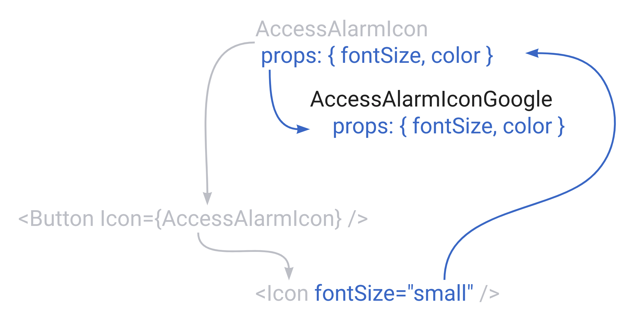
Lưu ý quan trọng, nếu dùng bên dưới nó sẽ không chính xác
const AccessAlarmIcon = () => <AccessAlarmIconGoogle fontSize="small" color="error" />;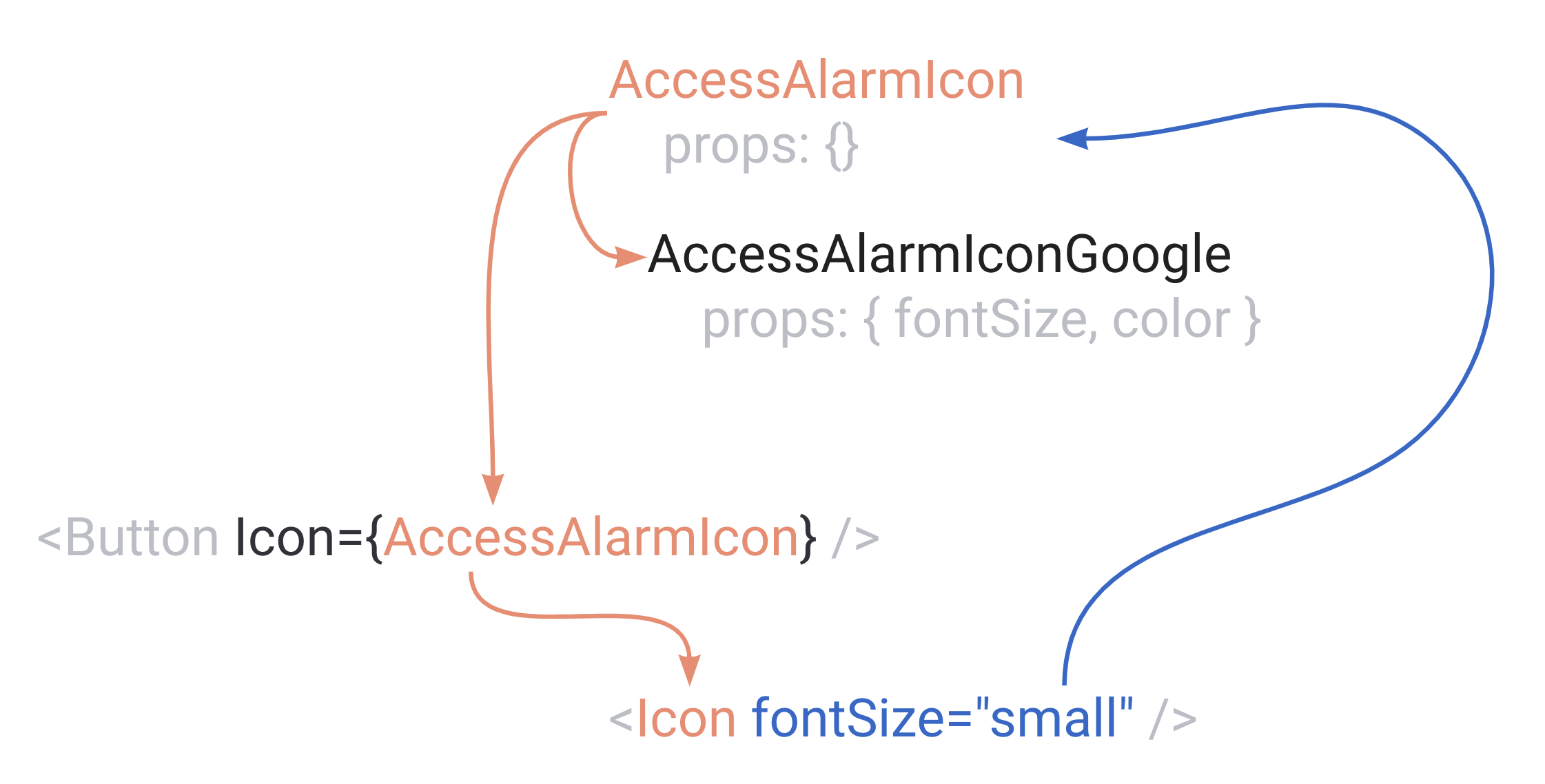
function
// chỉnh lại button component
const icon = renderIcon({
  fontSize: 'small',
});


// sử dụng
<ButtonWithIconRenderFunc renderIcon={(settings) => <AccessAlarmIconGoogle fontSize={settings.fontSize} color="success" />}>
  button here
</ButtonWithIconRenderFunc>
Để đưa ra quyết định cuối cùng, chúng ta cần nhắc đến tình huống sử dụng sau, khi hover vào button chúng ta thay thành một icon với màu khác
export const ButtonWithIcon = (...) => {
  const [isHovered, setIsHovered] = useState(false);

  return (
    <button
      onMouseOver={() => setIsHovered(true)}
      onMouseOut={() => setIsHovered(false)}
    >
      ...
    </button>
  );
};
Chúng ta sẽ thực hiện những thay đổi cần thiết, tùy theo cách truyền component
React Element
Chúng ta phải tạo một wrapper component cho icon để nhận prop từ phía <ButtonWithIconElement />
const AlarmIconWithHoverForElement = (props) => {
  return (
    <AccessAlarmIconGoogle
      {...props}
      color={props.isHovered ? 'primary' : 'warning'}
    />
  );
};

// sử dụng
<ButtonWithIconElement icon={<AlarmIconWithHoverForElement />}>button here</ButtonWithIconElement>
React component
Chúng ta sử dụng lại đúng như cách đã làm với prop color
const AccessAlarmIcon = (props) => <AccessAlarmIconGoogle {...props} color="error" />;

// ButtonWithIconElement
export const ButtonWithIconComponent = ({ children, Icon }: ButtonProps) => {
const [isHovered, setIsHovered] = useState(false);
  return (
    <button
	    onMouseOver={() => setIsHovered(true)}
	    onMouseOut={() => setIsHovered(false)}
    >
      <Icon fontSize="small" isHovered={isHovered} />
      {children}
    </button>
  );
};
Function
Tương tự color, chỉ cần truyền thêm prop isHovered
const icon = renderIcon({
  fontSize: 'small',
  isHovered: isHovered,
});

<ButtonWithIconRenderFunc
  renderIcon={(settings) => (
    <AccessAlarmIconGoogle
      fontSize={settings.fontSize}
      color={settings.isHovered ? "primary" : "warning"}
    />
  )}
>
Kết luận
Thành thật xin lỗi vì đã không thể có câu trả lời cho việc đâu là cách 100% đúng nên dùng trong trường hợp này. Việc lựa chọn pattern nào để sử dụng ở đây mang nặng tính cá nhân hơn là sự chuẩn chỉnh về logic, cuối cùng đường nào cũng sẽ về la mã.

Initializing...